
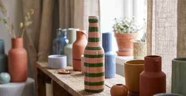
Colours can give a room a particular mood, but the experience is personal and shaped by culture and memories. So use colours as a tool to create the atmosphere you want, not as a fixed rule.
Contents
- The short answer: colours are a tool, not a rule
- Warm and cool colours: what's the difference?
- What do individual colours signal?
- Colours in different rooms: bedroom, living room, kitchen and hallway
- The personal side: your memories matter more than the theory
- Tips: test the colour in small doses before you choose a large surface
- Frequently asked questions
- Summary
You've probably heard that blue makes you calm and red makes you active. There's something to it, but it's not the whole story. In this guide, we look at what the different colours are often associated with, how warm and cool tones work differently, and how you can use colour in the bedroom, living room, kitchen and hallway without painting yourself into a decision you don't like.
We stick to what's widely recognised as rules of thumb, and we're honest that the effect of colour is individual. What feels calm to one person might feel cold or lifeless to another.
The short answer: colours are a tool, not a rule
Colours can set a mood in a room, but how strongly they work depends on you. Your culture, your experiences and the brightness and saturation of the shade itself all play a part in how you experience a given colour. There are no universal rules for how colours affect everyone, so use colours as inspiration rather than as a definitive answer.
That doesn't mean colour doesn't matter. It means it's a good idea to test things out on a small scale before choosing a large surface such as a wall or a sofa.
Warm and cool colours: what's the difference?
Colours are often divided into warm and cool tones. Red, orange and yellow are called warm colours and are often described as energetic and present in the room. Blue and green are called cool colours and are often experienced as calm and relaxed.
This division is a rule of thumb, not a law of nature. The effect is influenced by how light or saturated the colour is, as well as by your own experiences and the culture you grew up in. A deep, saturated blue can therefore feel completely different from a light, pale blue shade, even though both are called cool colours.
Tip: Want to try out a warm or cool colour without committing? Drape a throw in that colour over the sofa for a week or so and see how you feel about it.
What do individual colours signal?
Here's an overview of what the most commonly used colours in interior design are often associated with. Notice the word often. It's not a guarantee, but a common experience.
| Colour | Often experienced as |
|---|---|
| Red | Energetic, warm and present in the room |
| Yellow | Lively and warm, often associated with light |
| Green | Calm and cool, often associated with nature |
| Blue | Calm and cool, often associated with tranquillity |
| Pink | Playful and gentle, often used in smaller doses |
| Purple | Thoughtful, can feel both warm and cool depending on the shade |
| White | Simple and light, gives space to other colours |
| Black | Bold, often used as a counterweight to other colours |
Remember that the experience is personal, and that a shade's brightness and saturation change how the colour is perceived in practice.
Colours in different rooms: bedroom, living room, kitchen and hallway
In the bedroom many people place emphasis on calm, and cold or muted colours like blue and green are often used to support that mood. You can read more about how to create calm in the bedroom in Soveværelse indretning: Skab ro og harmoni.
In the the living room there's often room for more life, because the space is used for socialising. Here, a striped polyresin vase with parrots, pink and green from Kersten can help to liven up the palette without repainting a whole wall.
In the the kitchen many people choose warm colours like yellow, because they're often experienced as energetic and welcoming. See the range of yellow vases if you want to start small.
In the the hallway colour is the first thing guests meet, and a colourful detail can set the tone for the rest of your home. Read more about putting colours together the right way in Hvilke farver passer sammen i boligen?
Find colourful vases to test the palette in your own home.
See colourful vasesThe personal side: your memories matter more than the theory
Research into the effect of colours is mixed, and there's no single answer that applies to everyone. Your experience of a colour is shaped by what you associate it with: a childhood home, a trip, or a particular season.
That's why it's more important that you listen to your own reaction than that you follow a theory slavishly. If a colour that, according to theory, is supposed to be calming actually makes you feel uneasy, it's your own experience that counts most when decorating your own home.
Tips: test the colour in small doses before you choose a large surface
It's a good idea to try out a colour in small amounts before you paint an entire wall or buy a big sofa. Textiles and ceramics are obvious places to start, as they're easy to move or swap out if the colour doesn't feel right in the room.
You could, for example, style a green stoneware plant pot cover with a pink bow from EJA on a windowsill or place a pink ceramic fish vase from Kersten on a side table to see how the colour feels in your own living room. A purple-pink striped ceramic vase from GiftCompany can give the same test with a more muted purple tone.
See the full range of colourful vases and throws if you want to find more ways to test colour on a small scale.
Frequently asked questions
What do colours mean in interior design?
Colours can give a room a certain mood, but the effect is personal and influenced by culture and experience. There are no universal rules for how colours affect everyone.
Which colours are calming?
Blue and green are often called cool colours and are typically experienced as calming. However, how calming a colour feels depends on you yourself and on the shade's brightness and saturation.
Which colour is best for the bedroom?
There's no definitive answer, but many choose cool or muted colours like blue and green for the bedroom because they're often experienced as calming. Read more in Soveværelse indretning: Skab ro og harmoni.
What does the colour red mean?
Red is a warm colour often described as energetic. How strongly it affects you depends on your own experiences and on the shade's saturation.
Can colours affect your mood?
Colours can be experienced differently from person to person, and research into how colours affect mood is mixed. There's no guarantee of a particular effect on everyone.
Which colours suit a cosy home?
It's individual, but many associate a cosy home with warm colours like red, orange and yellow, as they're often experienced as energetic and present. Try things out with textiles and ceramics before choosing a large surface.
Summary
Colours can point the mood in a certain direction, but the final experience is your own. Use warm and cool tones as a starting point, test the colours in textiles and ceramics, and place most weight on how you yourself feel in the room.
Read also
- Hvilke farver passer sammen i boligen?
- Colour guide for the home: How to choose the right palette
- Soveværelse indretning: Skab ro og harmoni
- Colourful interior design: Against the dull white home
Ready to style with colour?
All the products in the shop have been hand-picked by Dinna, so you can find colourful details that suit your home perfectly.
Shop colourful vases