
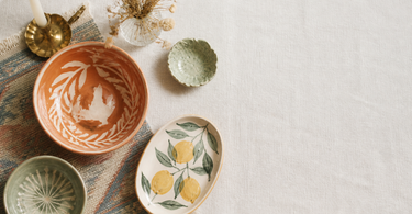
A successful colour palette starts with the colours you're already drawn to – in your wardrobe, in nature, in photos you save. From there, the 60-30-10 rule helps you distribute the colours correctly: 60% dominant, 30% secondary, 10% accent. Warm and cool tones behave differently in rooms. And you don't need to repaint – accessories like vases, rugs and candlesticks can shift an entire palette's mood quickly and cheaply.
Colour is probably the single change that transforms a room's feel fastest and most dramatically. Yet it's something many people hesitate over – because the choice feels overwhelming, and because mistakes can feel expensive to fix. But there is a system behind a good palette. This guide covers the key principles, from the intuitive starting point to concrete distribution rules and clever shortcuts with swappable accessories.
Start with what you're already drawn to
The best colour analysis has already been done – by you, over many years. Look in your wardrobe: which colours dominate? What colours fill your favourite photos on your phone? And which natural scenes do you find most beautiful – the blue-green ocean surface, the beech forest's warm ochre in September, or the cool grey Nordic winter sky?
The colours you consistently return to are the ones you'll thrive with in your home over time. It sounds simple, but it's the most reliable method. Interior psychology research suggests that people generally thrive best with colours that match their personal preferences rather than those that "should" work according to trend books.
Build on an anchor colour
Identify one colour as your anchor point. This is the colour you're most confident you love – and the one the other choices are built around. Is it a particular shade of dusty blue? A warm terracotta? A neutral clay white with yellow undertones? The anchor colour doesn't necessarily need to cover large surfaces; it just needs to guide the direction of the other choices.
If you find it difficult to identify one colour, you can start with an object you already own and love – a rug, a piece of ceramics or a poster. Use that object's colours as your starting point and build the palette from there.
Tip: Place a colourful object – such as a vase or a rug – centrally in the room and take a photo in greyscale. The tones that stand out, even without colour, are the ones with strong contrast and therefore the most visual weight in the room.
The 60-30-10 rule explained
60-30-10 is a classic distribution rule from interior design that gives a palette structure and balance. It works across styles and colour choices – whether you're working with neutrals or bold hues.
- 60% – the dominant colour: Walls and large furniture. This sets the room's basic mood and should be the colour you're most comfortable seeing a lot of.
- 30% – the secondary colour: Textiles, rugs and curtains. This colour complements the dominant one and creates depth. See for example colourful rugs, which can anchor a room's secondary colour on the floor.
- 10% – the accent: Here you're allowed to go bold. A striking colourful vase, a set of coloured candlesticks or a single coloured hook is enough to activate the palette without overpowering it.
The rule is a starting point, not a law
60-30-10 describes an ideal visual hierarchy – but it's not a formula to be calculated with a measuring tape. In practice, it's about one colour clearly dominating, another supporting it, and a third adding energy in doses that don't overpower the first two. A mistake many people make is distributing three colours evenly – this often results in a room that feels restless, because the eye lacks a natural resting point.
Warm vs. cool colours
Colours are divided into two temperature groups, and they behave very differently in a room:
| Warm colours | Cool colours |
|---|---|
| Yellow, orange, red, terracotta, ochre | Blue, green, purple, grey with blue undertones |
| Makes rooms feel more intimate and cosy | Gives a sense of calm and more space |
| Works well in large rooms that need to feel cosy | Works well in bedrooms and workspaces |
| Can feel overwhelming in very small rooms | Can feel cold and distant without warm accents |
Combine the two groups
The most interesting interiors typically operate in both temperatures. A room with cool, blue-green base tones can feel lively rather than lifeless if you add warm metals like brass – for instance as brass hooks and knobs in the hallway – or warm earth tones in a textile.
Conversely, a warm room with lots of ochre and terracotta can be balanced by a single element in cool slate-blue. The rule of thumb is that you never need to go "all in" on one temperature – a small counterweight of 10-15% from the opposite group keeps the room in balance.
Accessories as a colour tool
You don't need to repaint to change a room's colour palette. Accessories – vases, bowls, rugs, candlesticks – are a flexible and relatively cheap tool for adjusting, testing and switching up your palette.
A rug measuring 140 × 200 cm covers a considerable part of the floor area and can shift a room's mood significantly on its own. A cluster of ceramic vases in muted tones can pull a room down in temperature and give it a more organic, calm feel. Conversely, two or three strongly coloured candlesticks can activate a neutral room and give it the accent it's missing.
Change with the seasons
One advantage of using accessories as a colour tool is that you can switch up your palette seasonally. Many opt for warmer, deeper tones – burgundy, ochre, moss green – in autumn and winter, and lighter, cooler shades – dusty blue, aquamarine, off-white – in spring and summer. Because accessories are interchangeable, it requires neither filled-in walls nor a new furniture purchase.
Dishes and bowls in ceramic are an obvious place to start: they can sit on the shelf, on the dining table or in the windowsill and contribute colour and texture on a small surface. Combine, for example, three bowls in related colours – a deep blue, a dusty turquoise and a natural white – for a palette that feels cohesive without seeming monotonous.
How to test colours before you decide
Decisions about wall colour are hard to undo, and many regret choices that looked lovely on a colour chip but turned out different in the actual room. Here's a systematic approach to testing colours before you commit.
Light changes everything
A colour looks different in north- and south-facing light, in artificial light and daylight, morning and evening. Always test wall colours on large pieces of card – A2 size at minimum – and move them around the room at different times of day. Photograph them under different lighting conditions.
Test accents with what you already have
Before you buy something new, you can use existing objects as colour benchmarks. Put out an orange-coloured bowl you'd otherwise keep somewhere else, and live with it for a week. Does the colour feel energetic and positive, or do you get tired of it? It's a cheap test that can save you from more costly buying mistakes.
If you want to test a more exotic direction – for example, a patterned rug with strong colours – you can use decorative ornaments in related tones as a low-risk head start before investing in the big piece.
Tip: Photograph the room in black and white after you've added new colour accents. If the contrast works in greyscale, the visual balance is probably good – whatever colours you've chosen.
Frequently asked questions
What is the 60-30-10 rule in interior design?
It's a distribution rule that describes how three colours should be divided in a room: 60% to the dominant colour (walls and large furniture), 30% to a secondary colour (textiles and rugs) and 10% to an accent (vases, candlesticks and other accessories). The rule creates visual balance and a clear hierarchy in the palette.
Can I change a room's colour palette without painting?
Yes, you can. Rugs, vases, bowls and candlesticks affect a room's colour impression significantly. A 140 × 200 cm rug can shift the mood on its own, and a cluster of ceramic vases in new tones can update the accent. It's quicker, cheaper and reversible compared to wall paint.
What's the difference between warm and cool colours in a room?
Warm colours (yellow, orange, red, terracotta) make a room feel cosier and can make it seem smaller. Cool colours (blue, green, purple) create calm and give a sense of more space. You don't have to choose one temperature set – a mix with 10-15% of the opposite group keeps the room balanced.
How do I find out which colours suit me?
Look in your wardrobe and at the photos you save. The colours you consistently return to are a reliable signal of what you thrive with. You can also take your starting point from an object you already love and use its colours as an anchor point for the rest of the palette.
How do I add warmth to a room with lots of cool colours?
Brass details like hooks and knobs are an effective method, because brass has warm, golden tones that break up the cool tones without requiring a major colour change. You can also add a textile in ochre or terracotta – for example, a cushion or a small rug – as a warm counterbalance.
Can I mix lots of colours without it looking messy?
Yes, if you stick to related colour tones (the same temperature or colour family) and vary the saturation rather than mixing widely different hues. Three blue-green shades from deep-sea navy to light aqua can be combined harmoniously, because they share the same colour DNA despite differing intensity.
Summary
A good colour palette isn't random – it's systematic and personal at the same time. Start with the colours you already know you love. Use the 60-30-10 rule to give the palette structure and hierarchy. Understand how warm and cool colours behave differently in the room, and combine them deliberately rather than choosing one temperature set. And remember, you don't have to repaint to change course – accessories in the form of vases, rugs and candlesticks are a flexible and relatively cheap tool for continuously adjusting and experimenting with your palette.
Explore our range of colourful vases, coloured candlesticks and colourful rugs – and find the accents that activate your room's palette.