
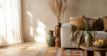
Colourful decor doesn't require a new kitchen or fresh paint on the walls. The most effective changes happen through accessories: vases, rugs, candlesticks and hooks. Start with one anchor colour — terracotta, dusty blue or fresh green — and build from there. Use the 60-30-10 rule of thumb as a loose starting point: neutral base, secondary colour, accent colour. And remember: a home should reflect you, not a colour scheme from a design textbook.
White walls are fine. They're neutral, bright and easy to live with. But they're also a safe route to the dull — and your home doesn't need to look like everyone else's. Colourful decor isn't about painting every surface signal red, but about adding personality exactly where it has the most impact. Often it's the smallest details that make the biggest difference: a vase in a warm ochre, a rug with a fresh pattern, a candlestick in deep blue-black. It doesn't require tradesmen or big budgets.
Where do you start with colours?
The shortest answer: with what you already have. Look in your wardrobe. Check your favourite photos on your phone. What do you instinctively gravitate towards — warm earth tones, cool blue-green shades, or sharp complementary colours? The colour you keep returning to again and again is your anchor colour. It becomes the starting point for everything else.
The lowest barrier to entry for colour is accessories. Colourful vases, textiles, candlesticks and plates can be swapped out without tools and without committing you to a particular direction. It gives you the chance to experiment at your own pace — adding one element at a time and seeing how it plays together with the rest of the room.
Start in one place
Many people make the mistake of wanting to do everything at once and end up with nothing. Choose one shelf, one corner table or one windowsill as your laboratory. Build up a small arrangement, live with it for a few weeks, and then adjust. It's easier to scale up than to clear out again.
Tip: If you're unsure whether a colour works, start with a single item in that colour rather than three. A single jug in burnt orange is easy to move around — a whole shelf converted to orange takes more convincing to undo.
Colours in ceramics and table setting
Ceramics are one of the most direct routes to colour in the home. A collection of ceramic vases in related tones — three shades of blue-green, for example, or a range from light dusty pink to deep burgundy — creates a calm, cohesive effect, even though the pieces vary greatly in shape.
European ceramic makers typically work with hand-painted surfaces, which means no two pieces are entirely identical. It's part of the material: uneven glaze, visible brushstrokes and small variations in the firing result give ceramics the visual complexity that mass-produced plastic goods can never replicate.
Table setting as colour play
Plates and cups aren't just functional — they make up a considerable part of the coloured surfaces you see in your home every day. Colourful plates and ceramic cups turn every meal into a little production. Melamine tableware from makers like Rice is also sturdy enough for the dishwasher and for families with children — colourful decor that actually survives everyday life.
| Material | Advantages | Considerations |
|---|---|---|
| Hand-painted ceramics | Unique surface, tactile weight, long lifespan | Typically hand wash recommended, higher price |
| Melamine | Hard-wearing, dishwasher-safe, child-safe | Not suitable for oven or microwave |
| Mouth-blown glass | Transparent colour, unique shape | Delicate, hand wash recommended |
Rugs: the floor's colour surface
The floor is the third largest surface in a room — after walls and ceiling — and yet it's the one fewest people think about when decorating with colour. A colourful rug can define a zone, add acoustic dampening and set the entire room's colour scheme in one decision.
A rug with a bold pattern or an unusual shape acts as a natural focal point. You can build the rest of the room around it — pulling one colour from the rug into the vases, another into the cushion colour, a third into a candlestick. It's an effective system because you don't need to invent colour combinations from scratch.
Animal shapes and graphic patterns
Manufacturers like Doing Goods have specialised in rugs shaped like animals — including leopards, tigers and dogs — in wool and cotton with colourful surfaces. A Doing Goods rug is a conversation starter in itself and works as a sculptural element in the room, even when it lies flat on the floor. Bongusta makes soft, plain-coloured rugs and bath mats in bright colours — an easy solution for the bathroom, which otherwise often stays neutral and dull.
Candlesticks and small things with big impact
Coloured candlesticks are one of the most underrated tools in colourful decorating. A group of three to five candlesticks in varying heights and colours on a side table creates a dynamic display. When the light is lit, the warm flames add yet another dimension: glazed ceramic surfaces reflect and absorb the light differently depending on the colour, and coloured glass candlesticks cast coloured shadows.
Ceramic candlesticks from European manufacturers are typically hand-formed and fired at temperatures between 1000 and 1280°C depending on the clay type and glaze. It's the high firing temperature that gives them their hard, waterproof surface and the distinctive ring when you tap them.
Hooks and knobs: the thing everyone forgets
Hooks and knobs are cheap, easy to fit and give a hallway or bathroom character in ten minutes. Coloured hooks and knobs in ceramic, metal or resin come in almost every colour and can be used as a recurring colour thread throughout a room. Pick one colour and use it consistently — on the hook by the front door, on the drawer knobs in the bathroom, on the coat rack in the hallway.
Which colours go together?
Colour theory can seem academic, but in practice it's about trusting your eye — and knowing a few rules of thumb that you can afterwards choose to ignore.
Complementary colours sit opposite each other on the colour wheel: blue and orange, red and green, yellow and purple. They create contrast and energy. Use them if you want a room with edge and dynamism.
Analogous colours are neighbours on the colour wheel: green, blue and purple; yellow, orange and red. They create a harmonious, calm mood that's easier to work with, but can become monotonous if there isn't enough variation in saturation and lightness.
The 60-30-10 ruleis a classic starting point: 60% neutral base (walls, large furniture), 30% secondary colour (sofa, curtains, rug), 10% accent colour (vases, candlesticks, details). It's a useful framework — but not a law.
Tip: Want to test a colour combination before you buy anything? Place the two colours next to each other in natural daylight — not in artificial light. Artificial light shifts colours' undertones significantly and gives a misleading picture of how they work together in your home.
Hallway and kitchen: the overlooked rooms
The hallway is the first thing guests experience — and the first thing you see when you come home after a long day. It's a small space with a big symbolic weight. Colourful hallway hooks, a single vase on a shelf or a patterned rug in front of the door instantly signals that someone with a point of view lives here.
The kitchen is another obvious place for colour that many people overlook. This is probably because kitchens are expensive to renovate, and many people are afraid of getting it wrong. But you don't need new cabinet fronts: colourful jugs on the table, coloured glasses and patterned plates on open shelves are cheap to swap out and easy to experiment with. Colourful kitchen utensils and storage jars from design-focused manufacturers make kitchen work more fun — and the space more inviting.
Frequently asked questions
Don't you get tired of lots of colours?
It depends on how you use them. If you keep large surfaces neutral and add colour through accessories and textiles, it's easy to switch things up whenever you fancy something new. Start with a few elements and add more over time. Most people find they can actually handle more colour than they thought — it just takes living with it.
Can colourful decor work in a small room?
Yes — and it can actually make it more interesting. Choose one or two colours and use them consistently instead of spreading too many shades around. A single colourful rug and two to three vases in the same colour can give a small room far more personality than a whole shelf of neutral objects.
What's the cheapest way to add colour?
Candlesticks and knobs. Both cost relatively little, are easy to swap out, and have a surprisingly big visual impact. A cluster of coloured candlesticks on a side table or new knobs on the kitchen cabinets changes the mood of a room without requiring a big investment — or committing to anything permanent.
How many colours is too many?
There's no fixed limit, but three to four colours plus neutral tones is a good starting point. The key is a common thread: one colour or colour group that repeats throughout the room and ties it all together. Without it, a room can quickly start to feel chaotic rather than colourful.
Do the rug, vases and candlesticks need to match each other?
Not necessarily match — but they need to talk to each other. That means they either share a colour, an undertone (e.g. warm earthy tones versus cool blue-greens) or an aesthetic (e.g. organic shapes versus geometric patterns). There's a difference between coordinating and cloning.
What do I do if I'm unsure whether colours fit into my home?
Use accessories as a test platform. Buy a single item in the colour you're considering, and live with it for two weeks. Move it around. See if you're happy to see it in the morning, or if it starts to annoy you. It's far easier to return a vase than to repaint a wall.
Summary
Colourful decor isn't about throwing out everything neutral and starting from scratch. It's about adding just enough colour that your home starts to feel like yours — not like a standard flat or a showroom. Start with the accessories: vases, rugs, candlesticks and knobs are the most flexible and cheapest ways to experiment. Use one anchor colour as your starting point, build on it slowly, and trust your own eye over colour schemes. 60-30-10 is a handy rule of thumb — not a rule you're bound by.
Explore our range of colourful home decor — from ceramics and rugs to candlesticks and hooks.