
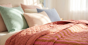
The short answer: pastel colours are light, muted shades, which look like a colour mixed with a lot of white. The best-known are pink, mint, light blue, light yellow and lavender, and they only become grown-up when you mix them with darker, more earthy tones.
Contents
- What exactly are pastel colours?
- The most-used pastel colours
- How to stop pastel colours looking childish
- Combinations: pastel with pastel, black and white, and earthy tones
- Pastel colours in the home: textiles, ceramics and candles
- Tips for getting started with pastel colours
- Frequently asked questions
- Summary
Pastel colours keep popping up in interiors, and for good reason. They're easy to spot, yet calming to have around, and they can be used in anything from a throw to a vase without taking over. Many people avoid them, though, because they're worried their home will end up looking like a nursery.
In this guide, you'll get a clear definition of pastel colours, an overview of the most-used shades, and practical advice on how to mix them with neutral and earthy tones so the result feels stylish rather than childish.
What exactly are pastel colours?
Pastel colours are light, muted shades that look like a colour mixed with a lot of white. It's the large amount of white that gives the colour its soft, muted look, whether the starting point is red, blue or yellow. What all pastel colours have in common is low saturation and high lightness, and that's exactly what makes them easier to combine than the saturated primary colours. A pastel colour takes up visually less space in the room, even though it still adds life and character.
The most-used pastel colours
Some pastel shades come up again and again in interiors because they're easy to work with and suit many styles. The most-used are:
- Pink
- Mint
- Light blue
- Light yellow
- Lavender
You don't need to use all five at once. Instead, pick one or two that suit your room, and let them recur in several details.
How to stop pastel colours looking childish
Pastel colours look less childish when combined with darker neutral tones, wood or brass. A pastel colour on its own can quickly start to resemble a nursery, but pair it with a dark sofa, a dark wood table or a brass candlestick, and the look instantly becomes grown-up and considered. The rule is simple: the more saturated and dark the counterpart is, the more sophisticated the pastel looks next to it.
Tip: Set a pastel-coloured detail against something in wood or brass, and it instantly gets a more grown-up look.
Combinations: pastel with pastel, black and white, and earthy tones
There are several ways to combine pastel colours, depending on the look you're after.
- Pastel with pastel: two or three pastel colours that sit close to one another, like pink and lavender, create a soft, harmonious look.
- Pastel with black and white: a single pastel colour set against black and white gets a clean, modern look, where the pastel is allowed to be the only splash of colour.
- Pastel with earthy tones: here, softness meets earthiness, and the result is warm without becoming sweet. A good example is a cotton throw in pink and brown from EJA, where the light pastel and the darker earthy tone work together within the same piece of fabric.
You can read more about how different colours work together in our guide on which colours go together in the home.
Pastel colours in the home: textiles, ceramics and candles
The easiest way to bring pastel colours into your home is through textiles, ceramics and lighting, because they're easy to swap out if you change your mind. A throw in the Quilt Ethnic pattern with pink and tigers from EJA gives a bold pastel touch over a sofa, while a throw with a small flower in yellow and pink from EJA is a softer alternative if you want to keep things more subdued.
On the shelf or coffee table, a pink fish vase in ceramic from Kersten or a purple-pink striped vase in ceramic from GiftCompany can add colour without taking up too much space. A pink-red striped vase in ceramic from GiftCompany can easily stand alongside it if you want more shades from the same family. Candlesticks in a calm material like brass or dark metal tie it all together and keep the look grown-up.
See the full range in our vases and candlesticks, if you want to put together your own combination.
Find more pastel-coloured vases and throws to style your home with.
See pink vasesTips for getting started with pastel colours
You don't need to change your whole home to get started. Start with one item, for example a throw or a vase, and see how the colour works in the room before you add more. Also stick to a maximum of three pastel colours at a time, and let them reappear in several places in the room, so it looks thought-through rather than random.
If you want a complete overview of how to choose and put together a whole palette for your home, you can read our colour guide for the home.
Frequently asked questions
What are pastel colours?
Pastel colours are light, muted shades that look like a colour mixed with a lot of white. They have low saturation and high lightness, which gives them a soft look.
Which colours are pastel colours?
The most commonly used pastel colours are pink, mint, light blue, light yellow and lavender.
How do you use pastel colours in interior design?
Start with a single item, such as a throw or a vase, and combine it with darker neutral tones, wood or brass for a thought-through look.
Which colours go with pastel colours?
Pastel colours go well with other pastels, with black and white, and with earthy colours like brown.
Are pastel colours childish?
They don't have to be. Combined with darker neutral tones, wood or brass, pastel colours look grown-up and stylish.
What is the most commonly used pastel colour?
Pink is one of the most commonly used pastel colours, along with mint, light blue, light yellow and lavender.
Summary
Pastel colours are light, muted shades that look best when kept to a few pieces and set against darker neutral tones, wood or brass. Start small with a throw or a vase, stick to a maximum of three pastel colours, and let them reappear in several places in the room.
Read also
- Which colours go together in the home?
- Colour guide for the home: How to choose the right palette
- Colourful interior design: Against the dull white home
- Romantic interior design: Create atmosphere at home
Ready to style with pastel colours?
All items in the shop have been hand-picked by Dinna, so you can find the colours in textiles, ceramics and candles without searching for long.
See pink blankets