
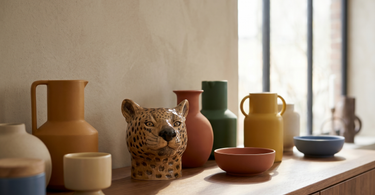
Colours work well together when you follow a deliberate colour scheme: complementary (opposite on the colour wheel), analogous (neighbouring colours), tone-on-tone (the same colour in several shades) or neutral with a single accent. A simple rule of thumb is 60-30-10: 60% main colour, 30% secondary, 10% accent. Start with one favourite piece and build the palette around it.
Contents
Choosing colours for your home can feel overwhelming – but behind beautiful interiors there are usually some simple principles at play. Once you understand the colour wheel and a couple of basic schemes, it becomes much easier to put together colours that work well with each other. Here's a simple guide.
Understand the colour wheel
The colour wheel is the tool behind most colour combinations. It shows how colours relate to each other: some sit next to one another, others sit opposite. That knowledge is the key to knowing what harmonises and what contrasts.
- Colours next to each other feel calm and harmonious.
- Colours opposite each other create contrast and energy.
- Shades of the same colour give a calm, cohesive look.
The four colour schemes
Most successful palettes are built on one of these four schemes:
- Complementary colours: opposite on the wheel, e.g. blue and orange. Creates contrast and life – use one as an accent.
- Analogous colours: neighbouring colours, e.g. green, yellow-green and yellow. Gives a harmonious, subdued look.
- Tone-on-tone: the same colour in several shades. Calm, elegant and easy to get right.
- Neutral with accent: a neutral base (grey, beige, off-white) spiced up with one bold accent colour.
Tip: If you're unsure, start with tone-on-tone or neutral with a single accent. They're nearly impossible to get wrong and give a calm, polished look.
The 60-30-10 rule
A classic rule of thumb for distributing colours in a room is 60-30-10. It ensures balance, so no colour dominates too much or disappears completely.
- 60 % main colour – typically walls and large surfaces.
- 30 % secondary colour – furniture and textiles.
- 10 % accent colour – vases, cushions and small details.
Warm vs. cool colours
Colours have a temperature that affects the mood of the room. Mixing deliberately – or sticking to one side – helps the palette hang together.
- Warm colours (red, orange, yellow) feel cosy and energetic.
- Cool colours (blue, green, purple) feel calm and relaxing.
- A small amount of the opposite temperature can bring life and balance.
Start with one piece
The easiest way to a good palette is to start with something you already love – a painting, a rug or a colourful vase. Pull the colours from there and build the rest around them.
- Choose a favourite piece with several colours.
- Pick out a main colour and one or two accent colours from it.
- Repeat those colours around the room in smaller doses.
Tip: A colourful vase is an easy and flexible way to test an accent colour. It's easy to move around and swap out if you want to try a new direction.
Overview of schemes
Here are the four schemes summarised briefly:
| Colour scheme | Expression | Good for |
|---|---|---|
| Complementary | Contrast and energy | A vibrant, striking room |
| Analogous | Harmonious and soft | Calm rooms such as bedrooms |
| Tone-on-tone | Elegant and cohesive | A sleek, calm look |
| Neutral + accent | Understated with a twist | Flexible rooms, easy to change |
Frequently asked questions
What's the easiest colour combination to get right?
Tone-on-tone (the same colour in several shades) and neutral with one accent colour are the safest bets. They give a calm, cohesive look and are hard to get wrong, even if you're a beginner.
What is the 60-30-10 rule?
It's a rule of thumb for distributing colours: 60% main colour (large surfaces), 30% secondary colour (furniture and textiles) and 10% accent colour (small details). It creates balance in the room.
Can you mix warm and cool colours?
Yes. A palette is often kept within one temperature for a sense of calm, but a smaller dose of the opposite temperature can bring life and balance – for example, a warm terracotta accent in a cool blue room.
How many colours should I use in a room?
As a rule of thumb, two to three colours work well, ideally supplemented with neutral tones. Too many colours can make the room feel restless. The 60-30-10 rule helps you keep the balance.
How do I find a good colour palette?
Start with a piece you already love – a painting, a rug or a colourful vase – and pull the colours from there. Pick out a main colour and a couple of accent colours, and repeat them around the room.
Summary
Colours work well together when they follow a deliberate scheme: complementary, analogous, tone-on-tone or neutral with accent. Use the 60-30-10 rule to distribute them, think about warm and cool tones, and start with one favourite piece to build the palette around. That way, creating a colour harmony that feels just right becomes both easy and fun.
Read also
Bring colour into your home with our colourful vases and other vases.
