
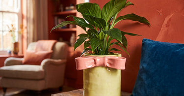
Complementary colours are colours that sit directly opposite each other on the colour wheel, such as red and green or blue and orange. They create the strongest contrast you can achieve, and they boost each other when combined.
Contents
You may have seen a room where two colours just work together, without you quite being able to put your finger on why. Often, the answer is complementary colours. It's not a complicated concept, but it does take a bit of a knack to use it in practice so it becomes atmospheric rather than jarring.
Here you'll get the definition, the classic pairs and concrete ways to use them in your home, from vases to blankets.
What exactly are complementary colours?
Complementary colours are the two colours that sit directly opposite each other on the traditional colour wheel. Because they're each other's opposite, a strong visual contrast arises when they meet. At the same time, something interesting happens: the colours boost each other. A green plant looks greener next to something pink, and a pink vase looks more pink surrounded by green leaves.
That's why complementary colours are used so much in art and interior design. They create life and energy in a room, but they can also become too much if you're not mindful of the amount and the shades.
The classic colour pairs
In the traditional artistic colour wheel, there are three classic pairs of complementary colours:
| Colour | Complementary to |
|---|---|
| Red | Green |
| Blue | Orange |
| Yellow | Purple |
If you want to know more about which colours generally work well together in the home, you can read Which colours go together in the home?.
How to use complementary colours without overdoing it
The most common guideline in interior design is called 60-30-10. It works like this: about 60 per cent of the room is kept in a main colour, 30 per cent in a second colour, and the last 10 per cent is an accent colour that's allowed to stand out sharply.
Applied to complementary colours, this means letting one colour dominate while the other only appears as an accent. If your home is mostly green, pink can be the little surprise in a vase or a cushion, instead of the two colours taking up equal space and competing for attention.
- Let one colour be the main colour in the room.
- Use the opposite colour in smaller amounts, as an accent.
- Avoid mixing in too many other colours, so the contrast doesn't get drowned out.
You can read more about putting together a whole palette for your home in Colour guide for the home: How to choose the right palette.
Tone down the shades if you want a calmer contrast
Sharp red against sharp green, or clear blue against pure orange, can quickly become quite intense and demand a lot from a room. If you want the contrast without it shouting, you can choose muted shades of the same colours.
Pink is a light, softer shade of red and still works as the complementary colour to green. Terracotta can take the place of sharp orange, and petrol can replace clear blue. The result is the same basic contrast, but in an expression that's easier to live with day to day.
Tip: Start small. A single pink vase or a pale pink cushion is enough to test whether you like the contrast before investing in more.
What it looks like in practice at home
The easiest way to try out complementary colours is through smaller items you can quickly swap out, such as vases, throws and cushions.
A pink vase against green leaves is a classic example. Put fresh branches or a green plant in a pink vase, and the two colours lift each other straight away. If you want to go the other way, a green throw can serve as the main colour on the sofa, while pale pink cushions are layered on top as the accent that breaks up the look.
If you already have green plants at home, a stoneware pot cover with a pink bow is a simple way to bring in pink-green contrast in a subtle way. If you want the colour directly in the vase, there are examples such as a striped vase with parrots in pink and green, a bow vase with green stripes and a pink fish vase in ceramic. All items in the shop are handpicked by Dinna, so they're chosen with exactly this kind of colour pairing in mind.
If you want to go broader than pink and green, you can find inspiration in the full range of Colourful vases.
Find the pink vase that can become the room's accent against the green.
See pink vasesMistakes to avoid with complementary colours
The most common misstep is using equal amounts of both colours. That doesn't create a dominant mood, but instead a visual tug of war, where the eye doesn't know where to land.
The second trap is too many patterns. If you combine striped vases, patterned throws and spotted cushions in both colours at the same time, the whole point of the contrast disappears. Instead, choose a few calm surfaces in one colour, and let the accent colour show itself in a single, clear element.
Frequently asked questions
What are complementary colours?
Complementary colours are colours that sit directly opposite each other on the colour wheel. They create the strongest contrast and enhance each other when paired together.
Which colours are complementary colours?
The classic pairs are red and green, blue and orange, and yellow and purple.
What is the complementary colour to green?
Red is the classic complementary colour to green, but pink, which is a light shade of red, also works well with green.
What is the complementary colour to pink?
Since pink is a light shade of red, green is the natural complementary colour to pink.
How do you use complementary colours in interior design?
Let one colour dominate the room, and use the opposite colour as an accent in smaller amounts, for example in a vase or a cushion.
What is the 60-30-10 rule?
It's a guideline where around 60 percent of the room is kept in a main colour, 30 percent in a second colour, and the last 10 percent is an accent colour.
Summary
Complementary colours such as red and green, blue and orange or yellow and purple create the strongest contrast in interior design. Use the 60-30-10 rule to let one colour dominate, choose muted shades like pink and green for a calmer look, and let the contrast show up in smaller things like vases and throws rather than in equal amounts everywhere.
Read also
- Which colours go together in the home?
- Colour guide for the home: How to choose the right palette
- Hvilke farver passer sammen med grøn?
- Colourful interiors: Say no to the boring all-white home
Ready to try complementary colours at home?
Take a look at our handpicked selection of green and pink vases and throws, and find the combination that suits your home.
Explore the colours