
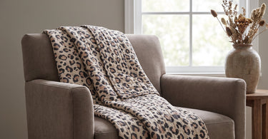
Taupe is a grey-brown shade that sits between brown and grey. The word is French and means mole, which gives a good picture of the colour's muted, earthy character.
Contents
- The short answer: taupe is a grey-brown shade between brown and grey
- Taupe, beige and greige: what's the difference
- Warm and cool taupe: how light affects the colour
- What goes with taupe
- Taupe at home: start small
- Tip: view the colour in both daylight and evening light
- Frequently asked questions
- Summary
You may have seen the word taupe on a colour swatch or in a property listing and wondered what it actually means. It's not quite brown and not quite grey, but something in between, and it can easily fit into many homes.
In this guide, you'll find out what taupe is, how it differs from beige and greige, and which colours and materials it works well with when you're bringing it into your home.
The short answer: taupe is a grey-brown shade between brown and grey
Taupe is a grey-brown shade that sits between brown and grey. The name comes from French and means mole, a reference to the muted, earthy tones of the animal's fur.
Because taupe is neither clearly brown nor clearly grey, it works as a calm, neutral base in your interior. It can be used alone on a wall or in textiles, and it lets other colours and materials take centre stage without drawing attention to itself.
Taupe, beige and greige: what's the difference
Beige is lighter and has a more distinct yellow tinge than taupe. Greige is a blend of grey and beige and therefore sits somewhere between the two, while taupe has more brown and grey in it and often appears calmer and slightly darker.
If you want to see the difference in practice, it can help to hold colour swatches up against each other. Beige leans towards warm and golden, greige is a more muted grey with a hint of beige, and taupe brings together the grey and brown in a shade that rarely feels overpowering.
Tip: If you're not sure how to put together a whole palette based on taupe, you can find inspiration in Colour guide for the home: how to choose the right palette.
Warm and cool taupe: how light affects the colour
Taupe can have a warm undertone with a hint of reddish or yellowish, or a cool undertone with more grey or greenish in it. Which undertone you notice depends both on the specific shade and on the light in the room.
Daylight and evening light can change how taupe appears. A wall or textile that looks warm and brownish during the day may lean more towards cool and grey when the light changes in the evening. That's why it's a good idea to view the colour at different times before you decide.
What goes with taupe
Taupe works as a calm, neutral base and can be combined with several other colours:
- Cream and white, which give a light and simple look
- Muted pink, which adds a soft, warm contrast
- Sage, which complements the earthy tones without competing
- Black, which creates contrast and gives a bolder look
- Brass, which adds a touch of warmth and shine
If you'd like to know more about how colours work together in the home in general, you can read Which colours go together in the home?orWhich colours go well with brown in interior design?
Taupe at home: start small
You don't need to paint every wall to try out taupe. Start small, with a throw over the back of the sofa, a piece of stoneware on the shelf or a wool blanket on the floor. That way, you can get a feel for the effect before you take the colour any further, onto the walls.
Take a look at Throws and Wool blankets, if you want to start with textiles, or see Stoneware, if you'd rather begin with ceramics on the table. If you want to add a touch of warmth to the earthy look, take a look at Brass potsorCandlesticks.
Find a throw or a piece of stoneware that can give your home a calm, earthy look.
See throwsTip: view the colour in both daylight and evening light
Before you paint a whole wall, it's a good idea to test the colour in practice. Lay out a throw or place a vase in the windowsill, and look at it in both daylight and in the evening, when the light is different.
If you have a colour sample or a fabric sample, move it around the room throughout the day. That way, you can see how taupe reacts to the light before you make your final decision.
Frequently asked questions
What colour is taupe?
Taupe is a greyish-brown shade that sits between brown and grey. The word is French and means mole.
What's the difference between taupe and beige?
Beige is lighter and has a more distinct yellow tinge, while taupe has more brown and grey in it and often feels calmer.
What is greige?
Greige is a mix of grey and beige and sits colour-wise between the two shades.
Which colours go with taupe?
Taupe can be combined with cream, white, muted pink, sage, black and brass.
Is taupe warm or cool?
Taupe can have a warm undertone with a hint of reddish or yellowish, or a cool undertone with more grey or greenish in it.
How do you use taupe in interior design?
Start small with textiles or ceramics, like a throw, a wool blanket or stoneware, and see the colour in both daylight and evening light, before you take it any further, onto the walls.
Summary
Taupe is a greyish-brown shade between brown and grey, calmer than beige and with more brown than greige. It can have a warm or cool undertone, and it goes well with cream, white, muted pink, sage, black and brass. Start with a throw, a vase or a wool blanket, and see the colour in different light, before you decide to paint the walls.
Read also
- Which colours go together in the home?
- Colour guide for the home: how to choose the right palette
- Which colours go well with brown in interior design?
- Minimalist interior design: Less is more
Ready to try taupe at home?
Every item in the shop has been hand-picked by Dinna, so you can easily find pieces that suit a calm, greyish-brown palette.
See the range