
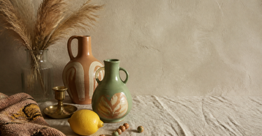
In 2025, home decor is moving away from muted, neutral palettes towards colours with more character. Earthy shades like burgundy, chocolate brown and deep olive green are setting the agenda alongside fresh tones like peach (Apricot Crush), Aegean Teal and Clay Pink. Colour drenching — one uniform colour across walls, ceiling and details — is one of the strongest techniques. The mood directions Dopamine Decor and Cottage Flow pull in opposite directions: energy versus calm.
Colours in home decor are changing. There's broad agreement among international trend agencies that 2025 marks a break from the minimalist, white-and-beige aesthetic that has dominated recent years. Instead, deeper, bolder colours are moving in — and they're being used actively to set the mood, define spaces and give your home a clear personality. This isn't a trend for trend's sake: research into colour psychology shows that hue and saturation directly affect our perception of a room's temperature, size and calm.
From neutral to characterful
Over the past five to six years, home decor has largely been about creating a neutral foundation: white walls, beige textiles, light wood. It gives flexibility, but can end up feeling soulless. In 2025, something different is happening: colour is moving out of the accessory role and into the very structure of the room.
That doesn't mean you necessarily have to paint the whole house burgundy red. It means colour is being used more intentionally — as a design choice rather than an afterthought. A dark green accent wall, a set of colourful dishes and bowls on the kitchen table or a single colourful rug can change the energy of a room significantly without requiring a full renovation.
Colour is also being used to connect indoors and outdoors. Earthy and nature-inspired tones bring the organic into the home — a trend rooted in the increased focus on wellbeing and presence at home.
Earthy, warm shades
The most dominant category in 2025 is warm, saturated earth tones. Here, we're not talking about the pale terracotta that characterised 2020–2022, but deeper, more complex versions:
- Burgundy and wine red — dark, warm and with a natural weight that works well on walls and in textiles.
- Chocolate brown — one of the most stylish neutral colours of 2025, replacing black in many contexts.
- Deep olive green — not the sharp army green, but a dusty, greyish version that works well with both wood and metal.
- Terracotta — still relevant, but now in darker, more burnt versions rather than the light clay tones of earlier seasons.
These shades provide depth and elegance, and they're particularly effective when combined with natural materials: untreated wood, handmade ceramics and rough textiles. A ceramic vase in earthy tones — whether a dark brown glaze or a dusty olive green — grounds the room and creates visual calm.
Tip: Combine earth tones in different saturation levels to avoid a flat look. A chocolate brown sofa works better with an olive green cushion than with an identical brown one — the contrast within the same colour temperature creates life without appearing chaotic.
Fresh colours and pastels
Alongside the warm earth tones runs another current: lighter, fresh shades with more personality than traditional pastels. Here are three named colours that keep popping up in the 2025 forecasts:
Apricot Crush
A warm peach shade with a touch of depth — not the paler baby-peach of previous seasons, but a more saturated version that can be used as an accent colour without feeling babyish. It plays nicely against natural materials and dark wood types.
Aegean Teal
A blue-green tone that sits somewhere between petrol and dusty teal. The colour has a natural calmness to it and is well suited to rooms where you want to create focus — for instance a reading nook or a work corner. It works well with brass and copper in accessories.
Clay Pink
Not the sheer millennial pink of 2017–2019, but a denser, more clay-filled version with beige undertones. Clay Pink is subtle enough to work as a warm neutral, but still has enough character to give a wall or a room personality.
These colours work well as a foundation for colourful vases and ceramic accessories that build on the room's palette without repeating it slavishly.
Colour drenching
Colour drenching is one of the most talked-about techniques of 2025 and covers a fairly simple idea: one colour is rolled out across all surfaces in a room — walls, ceiling, window sills, possibly furniture too. The result is a cohesive, cocoon-like room that feels more intentional than the classic "feature walls".
The technique works at both ends of the colour spectrum:
| Approach | Colour category | Effect |
|---|---|---|
| Dramatic drenching | Deep burgundy, navy blue, forest green | Theatrical, enveloping, well suited to smaller rooms such as the bathroom or hallway |
| Muted drenching | Clay Pink, pale green, light terracotta | Gentle, warm mood — works in the living room and bedroom |
A practical point: colour drenching highlights every imperfection in walls and ceiling, because surfaces you don't normally view together suddenly appear as one. It's wise to fill and sand thoroughly before painting.
Accessories for colour-drenched rooms should typically either match the tone (a monochrome look) or break with a clear complementary colour. Candlesticks in textured ceramic or glass work well in both strategies, because the surface itself offers visual variation.
Dopamine Decor and Cottage Flow
Behind the colour trends of 2025 lie two opposing moods, both of which are valid answers to the same underlying desire: for the home to feel like something.
Dopamine Decor
Dopamine Decor takes its name from the neurotransmitter associated with reward and motivation. The idea is simple: surround yourself with colours and shapes that actually make you happy. That could mean chartreuse-yellow cushions, a patterned rug in bold colours or a collection of ceramics in unexpected shades on the kitchen shelf. It's not reckless riot of colour — it's personal style put into a system. Dopamine Decor is about making active choices rather than following minimalism's rule of the most neutral possible.
Cottage Flow
Cottage Flow is the quiet counterpart. Here the palette is earthy and muted, the materials are natural and slightly uneven, and the mood is more cottage than design hotel. Think washed linen, handmade ceramics with visible fingerprints in the glaze, soft wool blankets in green and brown tones and flowers in untreated clay pots. It's an aesthetic that prioritises calm and craftsmanship over visual energy.
The two trends don't exclude each other. You can easily have a Dopamine Decor kitchen and a Cottage Flow bedroom — it's about which function and mood you want in the specific room.
How to use colours in practice
Theory is one thing — but how do you turn the trend picture into concrete choices? Here's a handful of practical approaches:
Start with accessories, not walls
It's far easier to change the colours on a table than to repaint an entire room. Start by testing a new colour in accessories: a pair of ceramic candlesticks in a new shade, a vase in Aegean Teal or a bowl in clay pink. If it feels right in the room, you can scale up.
Work with colour temperature
Warm colours (red, orange, yellow) pull visual surfaces closer and make rooms feel more intimate. Cool colours (blue, green, purple) push surfaces away and give rooms a sense of more space. Burgundy on a gable wall in the bedroom can make the room feel more cocoon-like and comfortable — not claustrophobic.
Use texture as a colour modulator
Matte surfaces absorb light and dampen a colour's intensity. Glossy glaze or polished surfaces enhance it. This means the same green colour can look very different on a matte ceramic vase and a glossy glass object. Use this effect to calibrate how prominent a colour should appear.
Let the accent colour run through the room
Accent colours work best when they appear in at least three places in a room — that way, they become part of the composition rather than a random whim. A chartreuse yellow might, for example, appear in a cushion, in a small vase on the shelf and in one book cover on the coffee table.
Frequently asked questions
Which colours are most popular in home decor 2025?
The most prominent are earthy and warm shades like burgundy, chocolate brown and deep olive green, as well as fresher tones like Apricot Crush (peach), Aegean Teal and Clay Pink. Chartreuse (yellow-green) is used as a bold accent choice. The movement is generally going from muted neutrals towards colours with more character and depth.
What is colour drenching?
Colour drenching means painting all surfaces in a room — walls, ceiling and window sills — in the same colour tone. The technique gives a cohesive, enveloping expression and works both in dramatic dark shades (e.g. deep forest green) and in milder, lighter tones like clay pink or pale green.
What's the difference between Dopamine Decor and Cottage Flow?
Dopamine Decor is the energetic, playful approach with bold colours and patterns that create joy in the room. Cottage Flow is the quiet counterpart: muted earth tones, natural materials and a cosy, rustic expression. Both are valid trends in 2025 and can easily coexist in the same home, just in different rooms.
Are neutral colours completely out in 2025?
No. Neutral colours are still a solid foundation — but they're changing character. The cool, muted beige and grey tones are giving way to warmer neutrals like chocolate brown, olive green and Clay Pink. It's not the death of neutrality, but a warming of the palette.
How do I test a new colour trend without committing to repainting?
Start with accessories: vases, candlesticks, bowls or a blanket in the desired tone. This gives you a real sense of how the colour plays with your light and your existing furniture. Accessories can easily be moved or replaced, unlike paint and large-scale textiles.
Do the warm earth tones suit all rooms?
Most earth tones work well in living rooms, bedrooms and hallways. Burgundy and chocolate brown can feel heavy in rooms with little natural light — here it's better to use them on one wall or in accessories rather than full colour drenching. In rooms with good daylight, even the deepest tones can work surprisingly well.
Summary
2025 brings a clear colour shift: the neutral and muted palettes are complemented — and sometimes replaced — by colours with more depth, character and personality. Earthy shades like burgundy, chocolate brown and olive green dominate the warm pole, while Apricot Crush, Aegean Teal and Clay Pink provide the fresh counterbalance. Colour drenching as a technique offers full colour commitment for those who want to go all the way. And the two overarching moods — Dopamine Decor and Cottage Flow — show that the 2025 colour trend isn't about one specific aesthetic, but about choosing consciously. Whether you want energy or calm in your home, the palette for it is ready.
Explore our range of colourful vases, ceramic candlesticks and colourful rugs — and find the accessories that translate this year's colour trends into your home.