
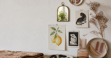
A personal gallery wall doesn't start with a hole in the wall — it starts with collecting things you actually love. Mix formats: posters, decorative plates, masks and wall hangings add depth and break up the rectangular frames. Curate as you go, find a unifying theme, and plan the composition on the floor before you drill. Use one dominant element as an anchor point, and adapt the wall to the room's furniture and function.
A gallery wall is easy to make — a personal gallery wall is harder. That's the difference between a wall that looks nice and a wall that actually says something about you. The trick isn't to buy a ready-made set of frames in the same size and hang them in a grid. It's about combining what matters to you in a way that gives the wall character — and that takes a little process, but no expertise.
Collect what you love
The first step is the most open: lay out everything you might want on the wall. It doesn't have to be exclusively pictures in frames. In fact, it's precisely the mix of formats that lifts a gallery wall from generic to thoughtful.
Consider what you have lying around or already hanging in your home:
- Posters and prints in different sizes
- Decorative plates (15–30 cm in diameter work well as wall decor)
- Masks in ceramic, papier-mâché or fabric
- Wall hangings or smaller textile pieces
- Mirrors that reflect light and add depth
- Wall decoration in metal, ceramic or woven material
Three-dimensional elements like plates, masks and ceramic hangings break up the rectangular frames that automatically dominate a classic gallery wall. They create movement and a kind of relief effect that a flat print can never achieve. Most importantly, each element should mean something to you — not just look right.
Tip: Decorative plates with a strong motif — animals, plants, geometric patterns — work particularly well as wall hangings because they have a natural weight and a round shape that breaks up an otherwise rectangular layout. Use a simple plate hanger on the back of the plate.
Collect over time — then sort
You don't need to have everything ready in one weekend. One of the best approaches is to collect things over time — a print you come across at a market, a postcard from a trip, a small ceramic mask you fell for — and let the collection grow organically over weeks or months.
When you feel you have enough to work with, spread everything out on the floor or a large table. From there you can see it with fresh eyes and start to sort. Remove what stands out — in colour, style or scale — and keep what naturally pulls in the same direction.
Remember that a gallery wall isn't permanent. What feels right today doesn't have to stay there in a year. Changing walls are a sign that the interior lives with you — not against you.
Find a unifying theme
When you spread the collection out, you'll often discover a pattern you perhaps weren't aware of. It might be:
- A dominant colour — warm earth tones, cool blue-green shades or a clear accent colour like terracotta or ochre
- A nature element — botanicals, waves, stones, animals
- A stylistic expression — graphic, illustrative, photographic, handmade
- A recurring motif — e.g. birds, citrus fruits, geometry
The theme doesn't have to be strict. It's more of a common thread than a rule. Two elements with very different styles can easily hang side by side if they share a colour or a mood. And if you have a fondness for ceramic wall decor from craft studios — prints from illustrators can mix well with textures in clay or woven material.
| Theme type | Examples | Suits |
|---|---|---|
| Colour-led | Ochre, terracotta, mustard | Living rooms with warm wood tones |
| Motif-led | Animals, botanicals, the sea | Children's rooms, hallways |
| Material-led | Ceramic + textile + paper | Nuanced, layered walls |
| Style-led | Graphic, illustrative, photographic | Home offices, corridors |
The floor as a test wall
Before you drill a single hole, lay all the elements out on the floor in the formation you imagine on the wall. It sounds simple, but it's actually the most time-saving method — you avoid unnecessary marks on the wall and can move things around freely.
A great trick is to photograph the composition from above. Stand on a chair or a stepladder, stretch your arms up and take a photo with your phone. From that angle you see exactly what you'd see standing looking at a finished wall — proportions, spacing and balance become clear in a different way than from the side.
Try at least 2–3 variations of the layout before you decide. Even a small shift of 10 cm can change whether a composition feels heavy at the bottom or balanced in the middle.
Tip: Trace the outline of your frames and objects onto newspaper, cut them out and tape them to the wall with masking tape. That way you can move and adjust without leaving any visible marks — especially useful on painted walls.
The anchor point in the composition
A personal gallery wall needs one element that is stronger than the others. It acts as an anchor point — the thing the eye lands on first, around which the other elements cluster.
It might be a large format print (A1 or larger), a striking mirror with a wide frame, a large ceramic plate or a wall hanging. The key is that it either has a stronger colour, a more captivating motif or a larger physical presence than the rest.
From that anchor point you build outward. Elements with strong colours or heavy materials are placed close to the anchor; lighter and more neutral pieces can move towards the edges. This gives a natural balance without making the composition symmetrical and dull.
If you're struggling to find the anchor point, ask yourself: What would I miss most if it weren't there? That's your anchor point.
Consider the room
A gallery wall doesn't exist in a vacuum. The room and its furniture set the frame — literally.
Bedroom
Here, calm is a virtue. Strong contrasts and busy motifs can disturb sleep and make the room feel restless. A gallery wall above the headboard works well with muted colours, soft textures and motifs that aren't too dense.
Living room and lounging areas
Rooms you spend a long time in can take more. There's room for greater contrasts, a mix of materials and elements that stimulate thought. However, be aware that the wall behind the TV shouldn't compete for attention when the screen is on.
Hallway and corridors
The hallway is the room you spend the least time in — but in return it's the first and the last. Here the gallery wall can be bolder and more compressed, because the eye absorbs it quickly. Feel free to combine practical elements like hallway hooks with decorative wall hangings, so the wall works double duty.
Home office
A context where you sit looking at the wall for a long time calls for something you won't tire of. Avoid too much visual noise — choose elements that inspire rather than distract. A single large print or a handful of illustrations with good spacing between them keeps the focus.
Remember to consider what furniture is in front of the wall. Do you need to be able to lean back in the sofa without hitting anything? Is there a lamp casting a shadow over a particular corner? The practical considerations are part of the aesthetic decision.
Frequently asked questions
How many elements should a gallery wall have?
It depends on the size of the wall and the character of the room, but a good rule of thumb is 5–12 elements for a standard wall 2–3 metres wide. Fewer elements require stronger individual contributions; many elements require a clearer unifying theme so the wall doesn't become visual noise.
What's a good alternative to posters in frames?
Decorative plates, ceramic wall hangings, masks, textiles and wall hangings are all strong alternatives. They add depth and texture that flat prints can't. Feel free to mix several materials — it's the combination that gives the wall its character.
Should the frames match each other?
Not necessarily. Uniform frames create calm and a more curated look. Mixed frames — different colours, materials and widths — give a more organic and personal energy. Choose the look that suits you and the room. One isn't better than the other.
What do I do if the wall ends up looking cluttered?
Check three things: whether there's a clear anchor point missing, whether the spacing between elements is too uneven (use 5–10 cm as a guide), and whether there's a shared theme in colour or motif. Try removing 1–2 elements and see if it clears things up — less is often more.
Can a gallery wall be hung without drilling holes?
Yes. Command hooks and strips with high load capacity (up to 3–7 kg per hook depending on brand) work well for lighter elements like prints and small ceramic objects. Heavy items like mirrors and large ceramic plates typically require screws and wall plugs for secure hanging.
What is the correct hanging height?
A classic rule is that the centre of the composition is placed at eye level — approximately 145–160 cm from the floor for most adults. Above a sofa or a seating piece it's typically lowered to 20–25 cm above the backrest, so the wall and furniture appear as a visual unit.
Summary
A personal gallery wall is the result of a deliberate process, not a spontaneous act. Start by collecting what you actually love — and include formats other than posters in frames. Sort over time, identify the theme that naturally emerges, and plan the composition on the floor before you touch the drill. Choose one anchor point, build outward from there, and adapt the wall to the room's function and furniture. That's the approach that makes the difference between a nice wall and a personal one.
Find inspiration for your next gallery wall in our selection of wall decoration, posters and prints and wall hangings.