
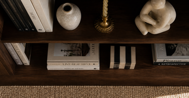
A shelf with personality is built on a few simple principles: use an odd number of objects (3 or 5), vary the height significantly, mix materials like ceramics, wood and metal, and let empty space be a deliberate part of the composition. An anchor piece grounds the eye, while book stacks act as plinths to lift smaller objects up in the shelf's visual hierarchy.
A shelf isn't just storage — it's a three-dimensional composition you build layer by layer. Yet most shelves end up looking cluttered, or conversely: clinically empty. The secret isn't owning the right things, but understanding the mechanisms that make a group of objects hang together visually. This guide covers the concrete principles you can use straight away next time you rearrange your shelf items.
The rule of odd numbers
The brain finds odd numbers more interesting than even ones. Three and five are the most commonly used groupings in interior design, because they force the eye to move rather than land on a symmetrical midpoint and stop. This mechanism comes from Gestalt psychology: symmetry is perceived as finished and static, asymmetry as dynamic and alive.
Groups of three
A group of three objects is the smallest unit that creates a composition. Place them in a triangular shape — one object tall, one low to the left, one in between the two to the right. This gives the eye a route to follow. Three vases of different heights is a classic example: they share a material character but are never identical in size.
Groups of five
Five objects give you the chance to create two sub-groups within one composition — two and three, or one and four. It's this division that gives the shelf depth without seeming overcrowded. Five figurines and sculptures spread across a 90 cm wide shelf will typically fill around 60-70% of the space, leaving natural "pauses" (more on that under empty space).
Tip: If you have an even number of objects you want to use, you can combine two small ones into one visual unit — for example, a small figurine in front of a book stack. The brain reads them as one object, and you keep the odd-number dynamic.
Variation in height — the shelf's rhythm
Height is the parameter that has the greatest impact on a shelf's visual energy. If you place all objects at the same height, you get a flat horizontal line — monotonous and uninteresting. If you vary the height significantly instead, rhythm is created: up, down, up, down — like a melody line.
A good rule of thumb is to work with at least three distinct height levels within the same shelf:
- Tall elements (30+ cm): Slender vases, tall plant sprigs or a cast letter. These act as visual anchor points and catch the eye from a distance.
- Medium-height elements (15-25 cm): Ceramics, decorative ornaments and compact sculptures. They tie the tall and low elements together.
- Low elements (under 12 cm): Candles, small vases and other mini objects. These create the downward movement that gives the composition its finish.
Avoid placing the tallest elements in the middle — that creates an all-too-predictable pyramid shape. Instead, try placing the tallest element at the 1/3 or 2/3 position from the left, corresponding to the photographic "rule of thirds".
A mix of materials and textures
A shelf made up of a single material — for example, only white ceramics — risks looking flat, even if it's styled correctly according to all the other rules. Material variation adds the sensory depth that makes a composition interesting to look at for more than a second.
The practical material palette
Three to four materials is typically the upper limit before the shelf starts to look chaotic. A working combination could look like this:
| Material | Function in the composition | Typical objects |
|---|---|---|
| Matte ceramics | Warm, organic base | Vases, bowls, figurines |
| Wood / bamboo | Natural, rough contrast | Trays, bookends, plinths |
| Brass / metal | Light and reflection | Candlesticks, pencil holders |
| Glass | Lightness and transparency | Vases, decanters, cloches |
A brass pencil holder next to a raw stoneware pot is an example of contrast that works — the shiny metal brings out the matte texture of the ceramic and vice versa. Choose materials that complement each other rather than compete.
Colour: a neutral base, one accent
Let 70-80% of the objects on the shelf stay within a neutral palette (white, beige, grey, black, natural tones). Use the remaining 20-30% on one clear accent colour — terracotta, forest green, navy. One accent is enough to add energy; two accents require deliberate balance and are harder to get right.
Empty space as a deliberate design element
Airspace isn't empty space — it's an active part of the composition. Many shelf stylings fail because the shelf is packed too full: the objects compete for attention, and nothing stands out. Empty space is what makes a single object look chosen rather than randomly placed.
A good guideline is to leave 30-40% of the shelf's surface open. That doesn't mean leaving one large, unbroken empty zone at one end. It's about distributing the airspace organically — a small "opening" to the left of one group, a couple of centimetres of distance between two objects in another.
Remember the depth too: shelves are usually 20-30 cm deep. Don't place all objects along one line at the back. Push one object forward towards the edge, another halfway back — this creates a three-dimensional composition that changes as you move past the shelf.
Book stacks as plinths
A stack of 3-5 books laid horizontally is one of the most underrated styling tools. It lifts a low object up in the shelf's visual hierarchy and creates an extra level of height without extra expense. The book stack works as an improvised plinth and gives the shelf a relaxed, lived-in quality, because books signal use — not decoration for decoration's sake.
Practical principles for book stacks
- Consistency in spine direction: Either turn all spines outward or all inward. Mixing looks unfinished.
- Colour coordination: Books with neutral or uniform spine colours work best as plinths — they blend in and highlight the object placed on top.
- Stack height: 3-5 books is ideal. Fewer than three looks random; more than five and the stack starts to dominate rather than support.
Place, for example, a small ceramic vase on top of a stack of four neutral books — it lifts the vase to eye level and gives it the attention it deserves without adding an extra object to the composition.
The anchor piece — the shelf's centre of gravity
Each shelf section should have one anchor piece: an object that's larger, darker or more visually heavy than the others. The anchor piece is the first thing the eye lands on, and it serves as a reference point for everything else. Without an anchor piece, the eye "drifts" around without finding rest.
What makes a good anchor piece?
It's about relative size and weight — not absolute size. A dark, matte pot of 25 cm can easily work as an anchor piece on a shelf with other objects of 20 cm, because the dark colour and heavy shape carry more visual weight. An anchor piece doesn't need to be expensive or dramatic — it just needs to stand out enough to give the composition a natural centre.
Good anchor pieces are typically:
- A wide, low bowl or vase in dark ceramic
- A sculpture or figure with a striking shape
- A stack of books combined with an object that together form a visual block
Place the anchor piece at the 1/3 position from the left or right — never exactly in the middle, unless you want a deliberately symmetrical composition. Build the other objects up around it: higher on one side, lower on the other.
Frequently asked questions
How many objects are too many on one shelf?
It depends on the width of the shelf section, but a rule of thumb is a maximum of 7-9 individual objects per 100 cm of shelf. Remember that two objects placed close together can read as one unit, which visually lowers the actual count. The most important signal is airspace: if you can see 30-40% open space, you're rarely overcrowded.
Do all objects on a shelf need to match in colour?
No — but they need to speak the same "language". A shared colour key (e.g. earth tones), a recurring material (e.g. ceramic) or a shared family of shapes is enough to tie objects together. A full colour match creates uniformity, but can feel lifeless. One contrasting colour is typically enough to create interest.
Can I use plants on shelves, and how do I style them in?
Plants work well as the "living" element that breaks up material monotony. Use them as either a tall element (a hanging plant that trails down) or as a low, compact unit (cactus, succulents in a small pot). Treat the pot as a standalone styling object — choose a vase or pot that matches the shelf's material palette.
What do I do if the shelf still looks cluttered, even after I've edited it?
Take a photo with your phone. The camera strips away the brain's 3D pre-understanding and shows the composition flatter — exactly as a visitor sees it at first glance. Clutter in a photo is typically caused by either too many heights at the same level, too many accent colours, or too little breathing space. Identify the dominant problem and solve it alone before you change anything else.
How do I keep the shelf dust-free and fresh over time?
Fewer objects are easier to maintain. Use stacks of books and larger objects rather than lots of small figures that gather dust quickly. A practical routine is to move all objects to one side while dusting and then restyle from scratch — this lets you regularly evaluate the composition and spot anything that can be edited away.
Do the same principles work on floating shelves and on shelving systems with many shelf sections?
The basic principles are the same, but on a shelving system with many sections you also need to think vertically: vary the visual weight from section to section (heavy at the bottom, lighter at the top isn't a rule — it's a tendency you can deliberately break). Make sure one anchor piece dominates per section, and that there's visual cohesion between the sections through colour or material.
Summary
Styling a shelf with personality is about mastering just a few, repeated principles: use odd numbers of objects in groups of three or five, build at least three distinct height levels, combine three to four materials using contrast logic, and let 30-40% of the shelf remain open as deliberate breathing space. Book stacks work as cheap and flexible plinths, and each shelf section should have one anchor piece that gives the eye somewhere to land. Once all these elements are in place, you don't need many objects — you need the right objects, in the right relationship to each other.
Explore our range of vases, figures, ornaments and small vases for your next shelf composition.