
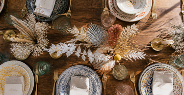
An eclectic table setting with ceramics needs one anchor colour to steer the whole look, a maximum of three main colours, and variation in shape and height. Mix materials such as ceramics, glass and brass in odd numbers — three candlesticks beat two every time. Choose one dominant plate style and let bowls, platters and accessories create the contrast. The result is a table setting that looks deliberately curated rather than random.
A mixed table setting with ceramics in different colours and shapes will either look thoughtfully composed or chaotic — and it's usually three to four choices that decide which side you land on. It's not about matching everything, but about creating a common thread the eye can follow. This article goes through the concrete rules for anchor colour, colour limitation, shape variation, material mix and odd numbers, so you can mix freely within a framework that holds together.
The anchor colour: your steering system
The anchor colour is the colour that appears more often than any other — typically in 60 per cent of the surface on the table. It doesn't have to be neutral, but it does need to be calm enough to work as a backdrop for everything else.
In practice, this means that your plates usually carry the anchor colour, since they make up the largest surface on the table. If you have white, off-white or stone-grey plates as your base, you can allow yourself far more freedom with bowls, platters and accessories.
What makes a good anchor colour?
An anchor colour works best when it:
- Is present in at least two different elements (e.g. plates and tablecloth or table runner)
- Contains undertones that can be paired with your secondary and accent colours
- Doesn't compete with the food — white, sand and blue-grey are classic choices
If your anchor colour is a deeper tone like bottle green or terracotta, your other elements need to be pulled back in intensity — not necessarily in colour.
Tip: Photograph your table setting in black and white on your phone before the guests arrive. If the contrast looks harmonious without the colour, the composition is solid. If it looks chaotic, there are too many elements carrying the same visual weight.
The three-colour rule in practice
The three-colour rule isn't a guarantee of a good result — but it is a good constraint. When you allow yourself more than three main colours, the likelihood of visual noise rises sharply, because the eye can't find anywhere to rest.
The three colours are typically distributed like this:
| Role | Share of the table | Typical elements |
|---|---|---|
| Anchor colour (dominant) | ~60 % | Plates, tablecloth, table runner |
| Secondary colour | ~30 % | Platters, bowls, napkins |
| Accent colour | ~10 % | Candlesticks, salt/pepper, flowers |
The accent colour is the element that's most often placed wrong — too small to create contrast, too big to work as an accent. Keep it to a maximum of two to three items, and preferably in a material that differs from the rest (brass rather than ceramics, for example).
Your colourful platters and bowls are the obvious secondary element: they carry colour without dominating, since they're usually placed centrally and only visible once the food no longer covers them.
Avoid colour traps
Two colours that are closely related (e.g. brick red and terracotta) read visually as one colour with noise. Either choose one of them, or make sure they have enough lightness contrast to stand apart clearly.
Variation in shape and height
Shape and height variation is what separates a curated eclectic table setting from one that simply looks messy. The principle is simple: every level of the table should have at least one element with a clear vertical dimension.
Three levels to work with:
- Low (0–5 cm): Plates, platters, napkins, salt and pepper shakers
- Medium (6–15 cm): Bowls, low vases, candles in dishes
- Tall (16 cm+): Candlesticks, tall vases, carafes
A table that only works at the low level looks flat and unengaging. A table with elements at all three levels creates depth and gives the eye something to move between.
Combine round plates with dishes and bowls in oval or irregular shapes — this breaks up the monotony without requiring you to swap out your base tableware. An oval serving dish in the middle of the table immediately provides a formal break from the round central surfaces.
Shape contrast at plate level
Even within the same stack of plates, you can create variation: a flat dinner plate as the base, a deep pasta or soup bowl on top, and a small tasting bowl to the side. Three shapes, the same colour — and you've already got shape variation without mixing colours.
Material mix: ceramics, glass and brass
Ceramic, glass and brass are a classic trio because they differ along three dimensions: surface texture, light transmission and colour temperature.
- Ceramic absorbs light and gives a matte, warm or cool surface depending on the glaze
- Glass transmits and reflects light — it creates movement and lightness in the composition
- Brass reflects light in a warm, golden spectrum and acts as an accent that ties the warm tones in the ceramics together
Your glass doesn't need to match in colour — in fact, a mix of clear glass, smoked glass and lightly tinted glass is more interesting than a uniform set, as long as the silhouette (tall/low, wide/narrow) is consistent within the same function.
Brass typically appears in candlesticks, cutlery handles and serving utensils. Use it sparingly — two to three brass pieces are usually enough to tie a warm palette together without it becoming dominant.
Don't forget salt and pepper sets as a place where the material mix can be emphasised: a ceramic pot combined with one in glass or with a brass touch is a small but readable signal that the mix is deliberate.
Odd numbers and asymmetry
Odd numbers are one of the most well-documented visual principles in interior design and styling: three, five or seven items grouped together are perceived as more dynamic and natural than two, four or six. This is because with an odd number, the eye can't automatically split the group into two symmetrical halves and is therefore forced to move around within the group.
Apply the principle in practice:
- Three candlesticks instead of two — vary the height
- Five bowls for starters rather than four or six
- A group of three decorative elements in the centre of the table
Asymmetry also applies to placement: instead of centring everything exactly, shift your centre arrangement three to five centimetres to one side. It looks deliberate rather than off.
Tip: Arrange three items in a triangular formation rather than a straight line — one tall at the back, two low ones in front at different heights. This creates depth and works both from the side and from the end of the table.
Step by step: putting the table setting together
Here's a concrete order of steps that reduces the risk of ending up with an overcrowded or unbalanced table setting.
Step 1: Lay out the anchor colour
Start with the base — tablecloth, table runner or placemats — and put your plates in place. Step back and confirm that the anchor colour is present across at least 60 per cent of the surface.
Step 2: Place the glassware and cutlery
Glassware and cutlery define the vertical rhythm along each place setting. Don't vary the glass type per setting — stick to one glass style per function (water, wine).
Step 3: Add the centrepiece
Place your central serving element — an oval serving dish, a plate of fruit, a low vase with greenery — and work from there. This is your anchor point for shape height and colour balance.
Step 4: Distribute accessories in odd numbers
Candlesticks, salt cellars, decorative elements: place in groups of three or five. Rotate them slightly relative to one another — never perfectly parallel.
Step 5: Overhead photo and adjust
A bird's-eye photo quickly reveals whether there are zones with too much or too little going on. Move one element at a time until the composition looks balanced from every angle.
Frequently asked questions
Can I mix ceramics from different brands and ranges?
Yes — in fact, this is typically more interesting than one uniform range. The important thing is to stay within your anchor colour and a maximum of three main colours. Differences in glaze, surface texture and shape are an advantage, not a mistake, as long as the colour palette is coordinated.
What do I do if the table looks messy even though I've followed the rules?
Check whether you have elements of the same visual weight competing with each other. Remove one element at a time, starting with the smallest. Often it's the fourth colour or the fifth material that's creating the noise. A table with a little too little is always better than one with a little too much.
How does brass work in a cool blue-grey palette?
Brass can work in a cool palette, but use it very sparingly — a maximum of two items. Alternatively, brushed steel or silver-toned metal can work better, as they don't bring warm tones into the composition. Decide before you start, and stick to one metal choice.
How many candlesticks are too many?
It depends on the length of the table: for a table for four to six people, three candlesticks is usually the maximum. For a long table for eight or more, you can work with two groups of three. Keep the candlestick heights varied within each group, but consistent across the groups.
Can I use a colourful dish as an anchor element instead of a neutral base?
It's possible, but requires you to reduce the complexity everywhere else. A dark blue or terracotta-coloured dish as a centrepiece with white plates and clear glass can work very elegantly. Let the dish be the accent colour and keep the rest in the anchor colour — avoid adding a third strong colour.
Are there rules for which shapes go well together?
A rule of thumb: mix organic and geometric shapes, but stick to a maximum of two categories. Round plates with an oval bowl and a rectangular dish work because you have one repeating curved shape (round and oval) and one contrast (rectangle). Don't mix three completely unrelated geometries at once.
Summary
A successful eclectic table setting with ceramics is about deliberate choices, not random variation. Choose one anchor colour that covers 60 percent of the table's surface, limit yourself to two secondary and accent colours, and work with variation in shape and height across three levels. Mix ceramics, glass and brass deliberately — each material contributes a different visual quality. Arrange accessories in odd numbers and use triangular formations rather than straight lines. Follow the working order, take a bird's-eye photo before serving, and be willing to remove rather than add. Simplicity within a varied system is always more convincing than complexity for complexity's sake.
Explore our range of plates, dishes and bowls and colourful platters and bowls for your next table setting.